| Database Toolbox | |
Chart Display of Results
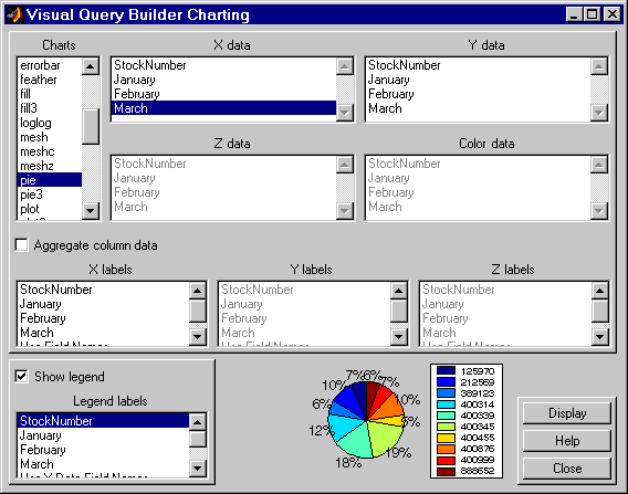
pie to display a pie chart.The preview of the chart at the bottom of the dialog box shows the result of your selection. For this example, it shows the pie chart, with each stock item appearing in a different color.
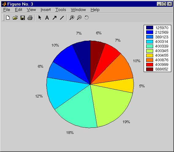
March from the X data list box to display a pie chart of March data.The preview of the chart at the bottom of the dialog box reflects the selection you made. For this example, the pie chart shows percentages for March data.
The pie chart appears in a figure window. Because the display is presented in a MATLAB figure window, you can use some MATLAB figure functions such as printing or annotating the figure. For more information, use the Figure window's Help menu.
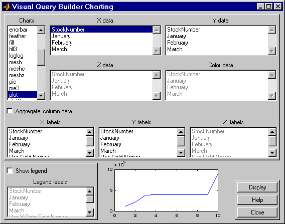
There are many different ways to present the query results using the chart feature. For more information, click Help in the Charting dialog box.
| | Relational Display of Data | Report Display of Results in a Table | |
 . For more information, use the Figure window's Help menu.