| Report Generator | |
Creating Component Attributes
Component attributes determine how a component behaves and what information it inserts into the report. You can see component attributes in the Options tab of the Setup File Editor.
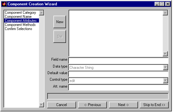
You create an attribute page for the new component on the Component Attributes page of the Component Creation Wizard.
Click on Component Attributes in the list box on the left to get to the Component Attribute page. Or, if you have just completed the Component Name page, click on Next ->.
Component Attribute Tutorial Task 1
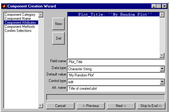
For the first component attribute tutorial task, you will create an attribute that lets you put a title on your plot. This attribute will have an editable text field. The default title will be My Random Plot. This attribute should appear on the attribute page with the name: Title of created plot.
Specifying the Field Name
The field name is the name of the attribute. It must be a valid variable name (e.g., no spaces, etc.).
Tutorial Task
Plot_Title
Note that the field name must be a valid variable name, so if you enter Plot Title, it changes to Plot_Title as soon as you press the Enter key.
Specifying the Data Type
The data type is the type of data that is used by the attribute. For more information, see Programming and Data Types in the MATLAB documentation.
The Data type drop box contains the following options:
Tutorial Task
In the Data type drop box, select
Character String
Setting the Default Value
You set the value that will be displayed on the attribute page as a default value for this attribute.
Tutorial Task
In the Default value field, enter
'My Random Plot'
Setting the Control Type
The control type is the type of control you want to use to represent and change the attribute.
To see what each type of control looks like, type guide at the command line to get the Guide Control Panel. The icons for each control has a tooltip, and you can see what a control looks like by selecting it and bringing it into the palette area. Or, you can see the help for the uicontrol function for information about each kind of control.
The available options for Control type depend on the Data type that you chose earlier. The table below shows the available data types for each control type.
Tutorial Task
In the Control type drop box, select
edit
Specifying the Attribute Name
The attribute name appears in the Options tab of the Setup File Editor (in the component attribute page). The attribute name should be short (two to four words).
Tutorial Task
Title of created plot
Looking at the New Component Attributes Page
After you have completed the tutorial tasks, the Component Attributes page will have the following appearance.
Creating Another Attribute
To create another attribute, click on the New button. To delete an attribute, select it and click on the Del button.
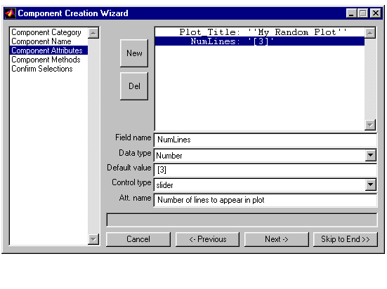
Component Attribute Tutorial Task 2
This task creates another attribute. This attribute lets you control the number of lines that appear in the plot. The default number will be 3. The UI control for this attribute will be a numerical slider. This attribute will appear on the attribute page with the name: Number of lines to appear in plot.
First click on the New button and then enter the following parameters:
NumLinesNumber3]sliderNumber of lines to appear in plotAfter you have completed the tutorial tasks, the Component Attributes page will have the following appearance.
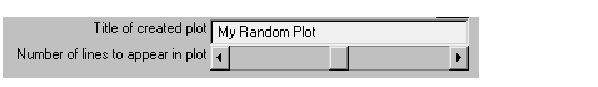
These are the attributes you just created.
| | Creating the Component Name | Creating Component Methods | |