| Graphics | |
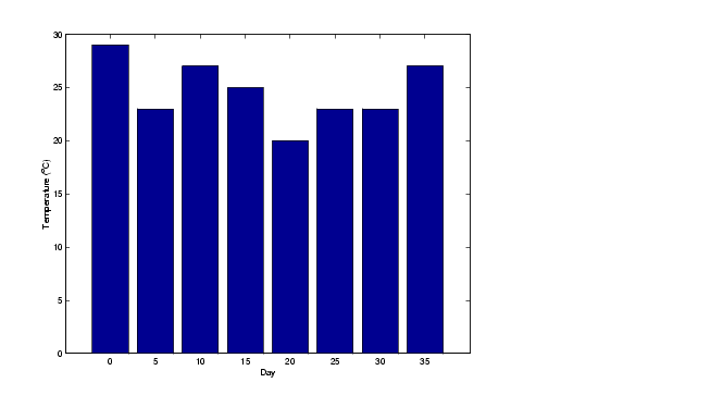
Specifying X-Axis Data
Bar graphs automatically generate x-axis values and label the x-axis tick lines. You can specify a vector of x values (or y values in the case of horizontal bar graphs) to label the axes.
For example, given temperature data,
temp = [29 23 27 25 20 23 23 27];
obtained from samples taken every five days during a thirty-five day period,
days = 0:5:35;
you can display a bar graph showing temperature measured along the y-axis and days along the x-axis using
bar(days,temp)
These statements add labels to the x- and y-axis.
xlabel('Day')
ylabel('Temperature (^{o}C)')
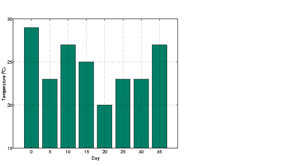
Setting Y-Axis Limits
By default, the y-axis range is from 0 to 30. To focus on the temperature range from 15 to 30, change the y-axis limits.
set(gca,'YLim',[15 30],'Layer','top')
| | Stacked Bar Graphs to Show Contributing Amounts | Overlaying Plots on Bar Graphs | |